Product Design
Designing a tool that makes design process visible.
From a blank brief to 100+ beta signups.
New Craft Society
5 min read
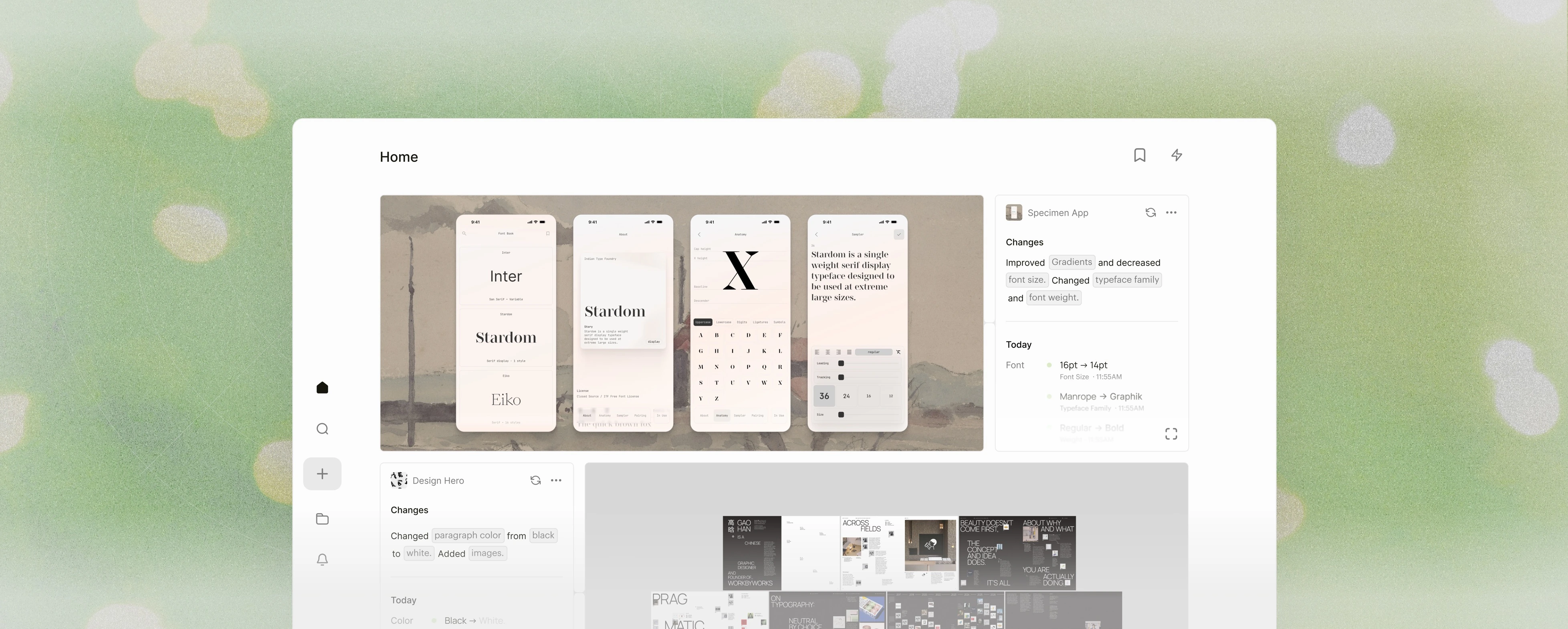
CoCreate is an educational design platform for early‑career designers.
New Craft Society is its newest vertical: a tool that helps junior designers keep track of their process and show it. I led it from 0 to 1, owning the brand identity, product design, front end, and landing page.
[Visit website]Overview
How might we capture work in progress with so little friction that the case study writes itself?
Software has never been faster to build or fuller of features, yet only a few tools are purpose-built for designers. As CoCreate’s first design intern, I set out to build the tool junior designers were missing.
Problem
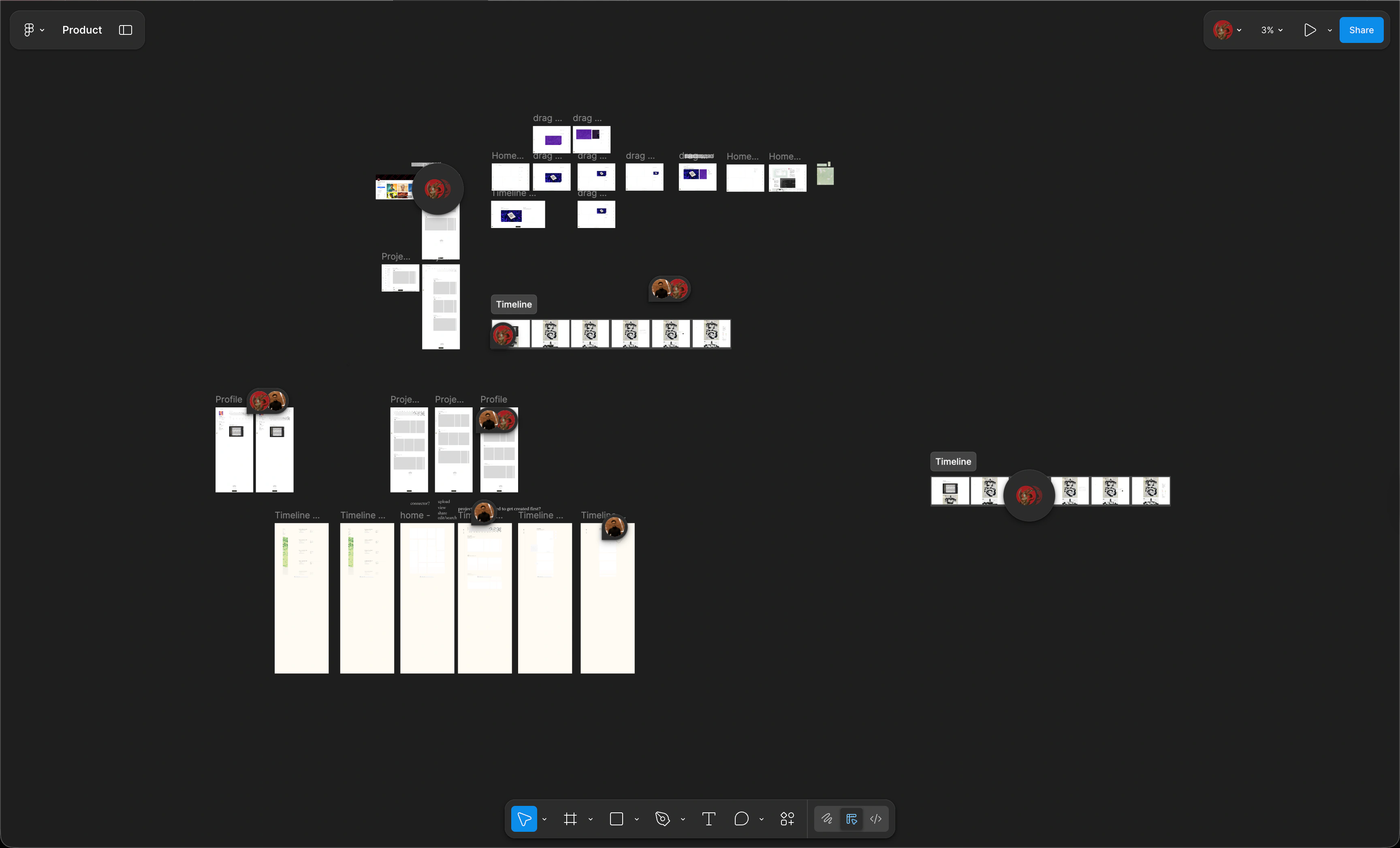
There is a market gap for tracking design process the same way developers track code with Git.
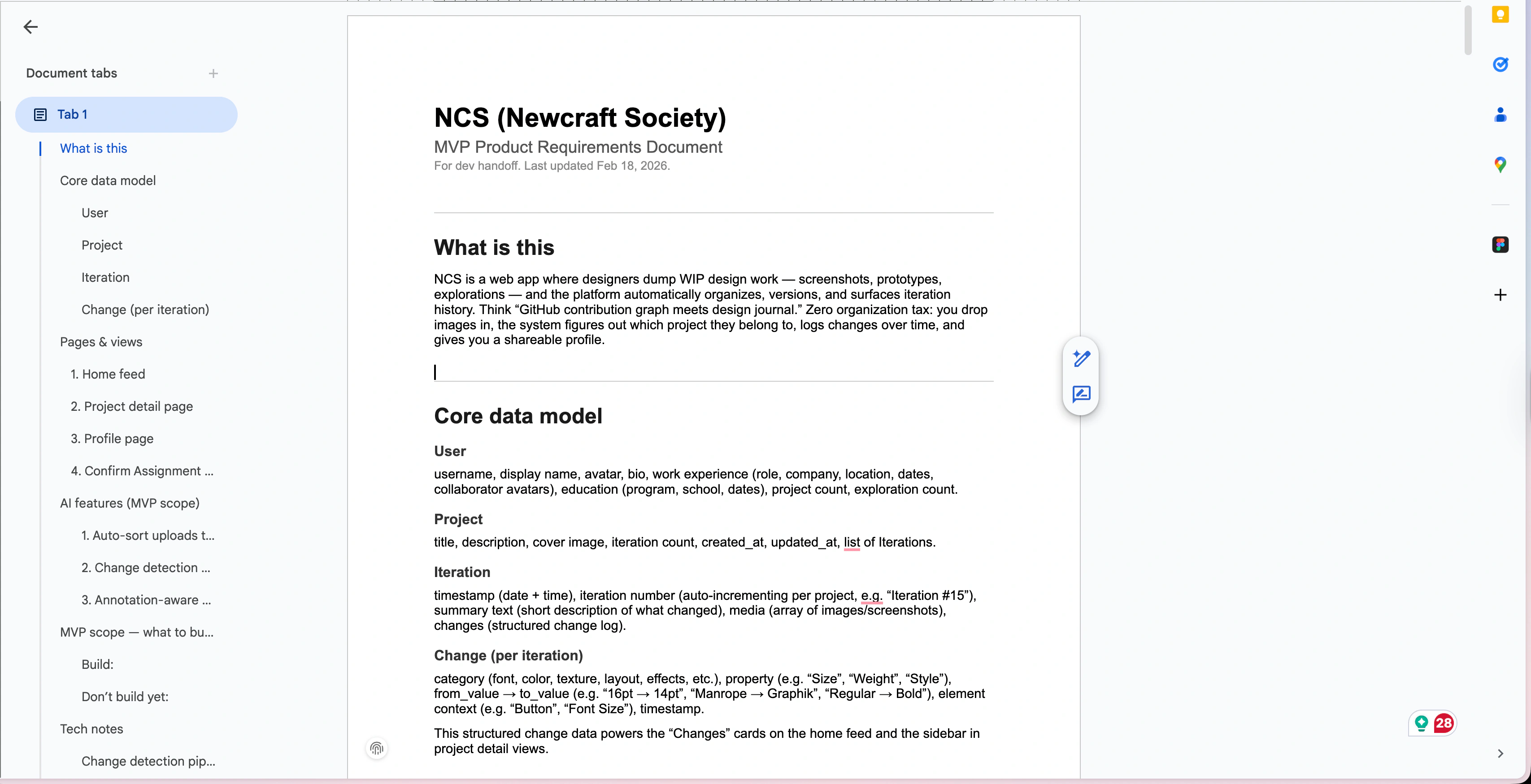
Oftentimes, a designer’s work is scattered across mediums: Figma, FigJam, slides, research docs, PRDs, and GitHub repos. What’s missing is a way to keep track of your process across all of them.
Solutions
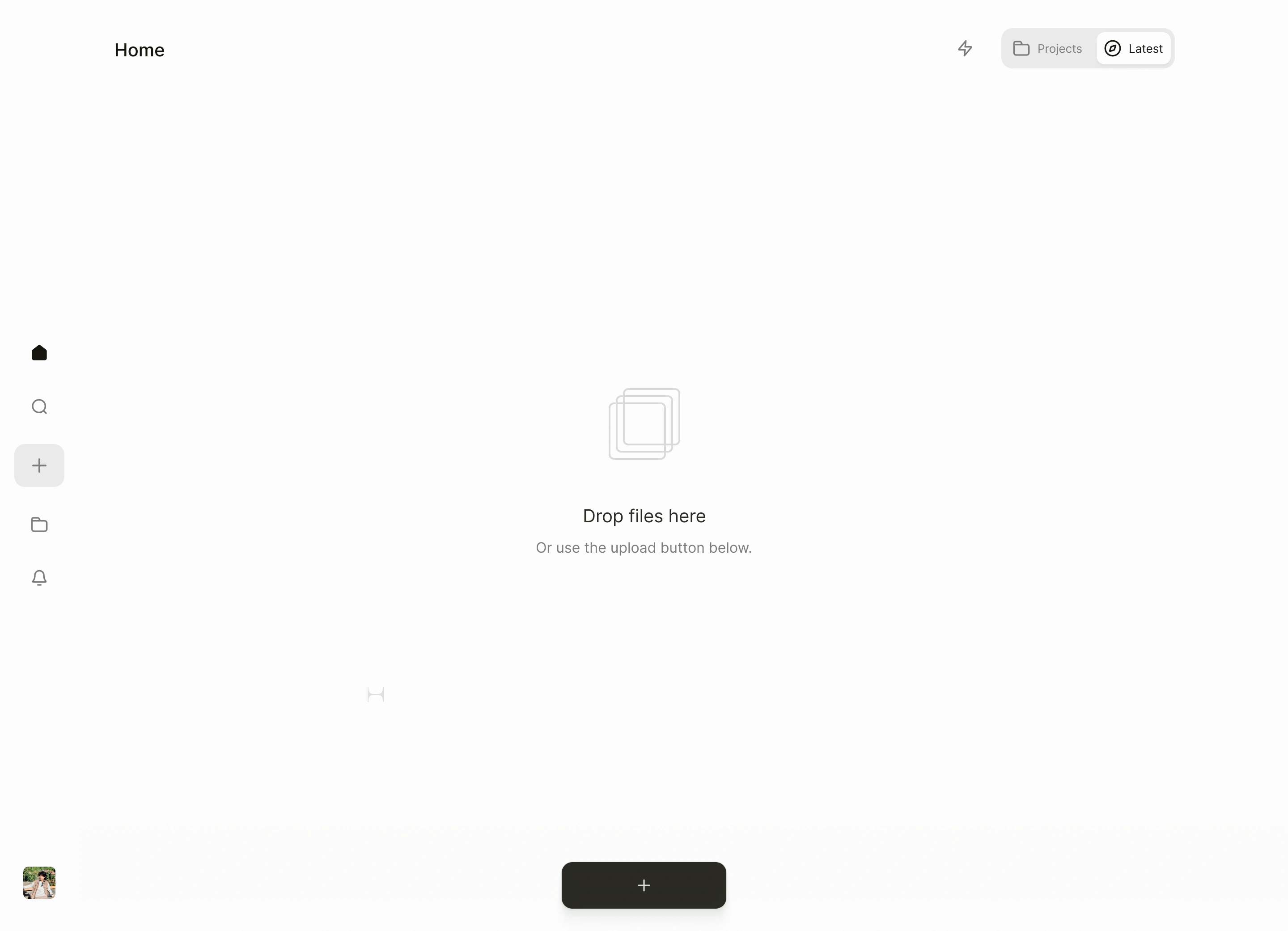
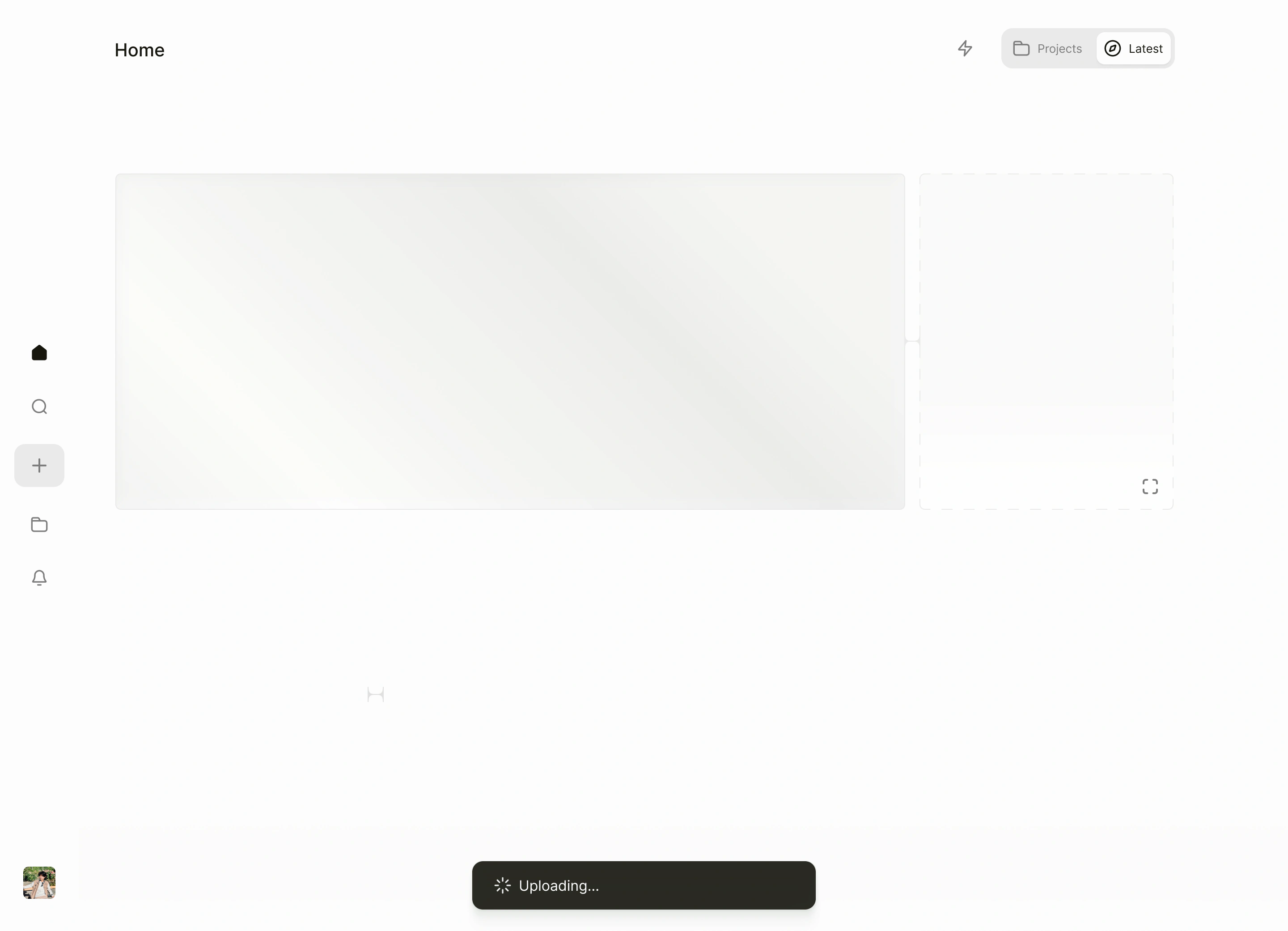
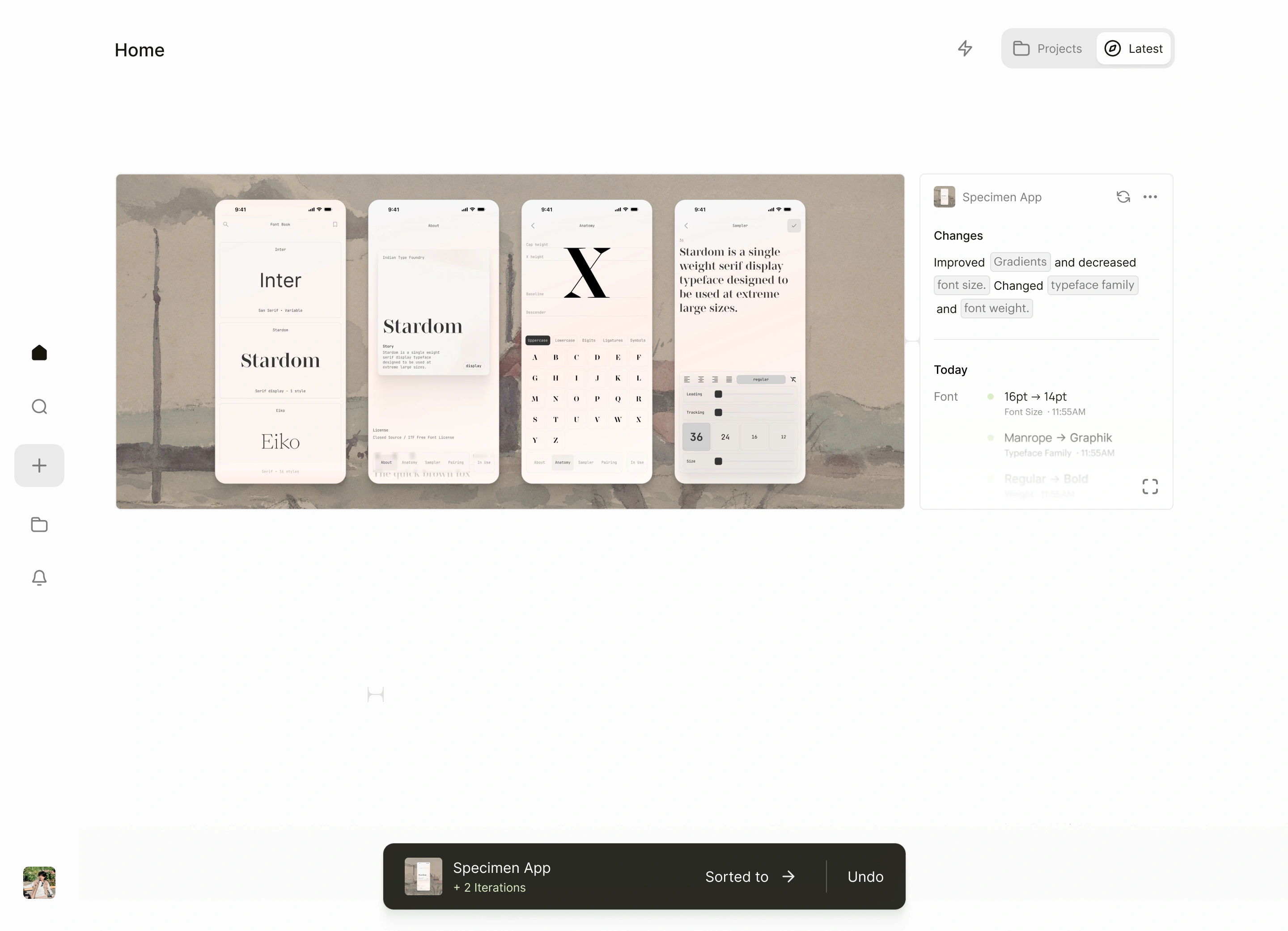
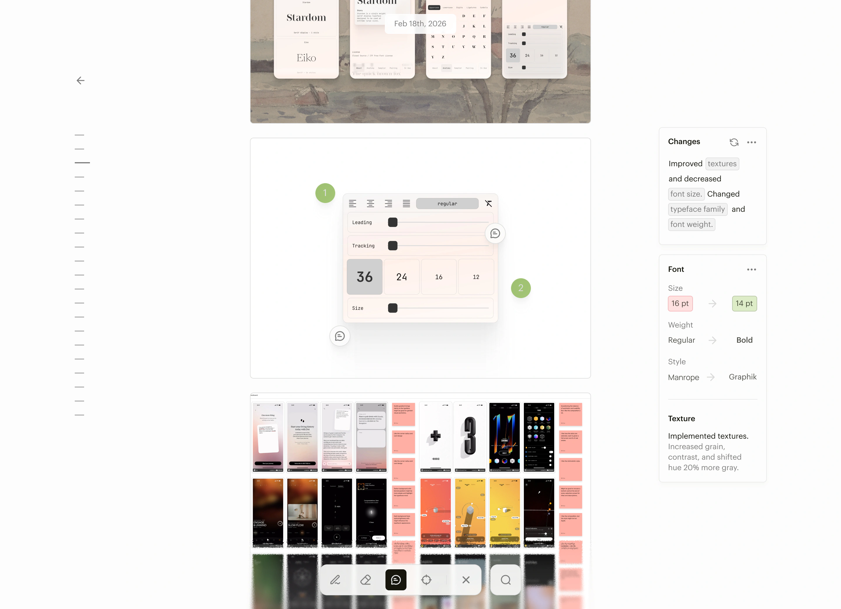
Upload
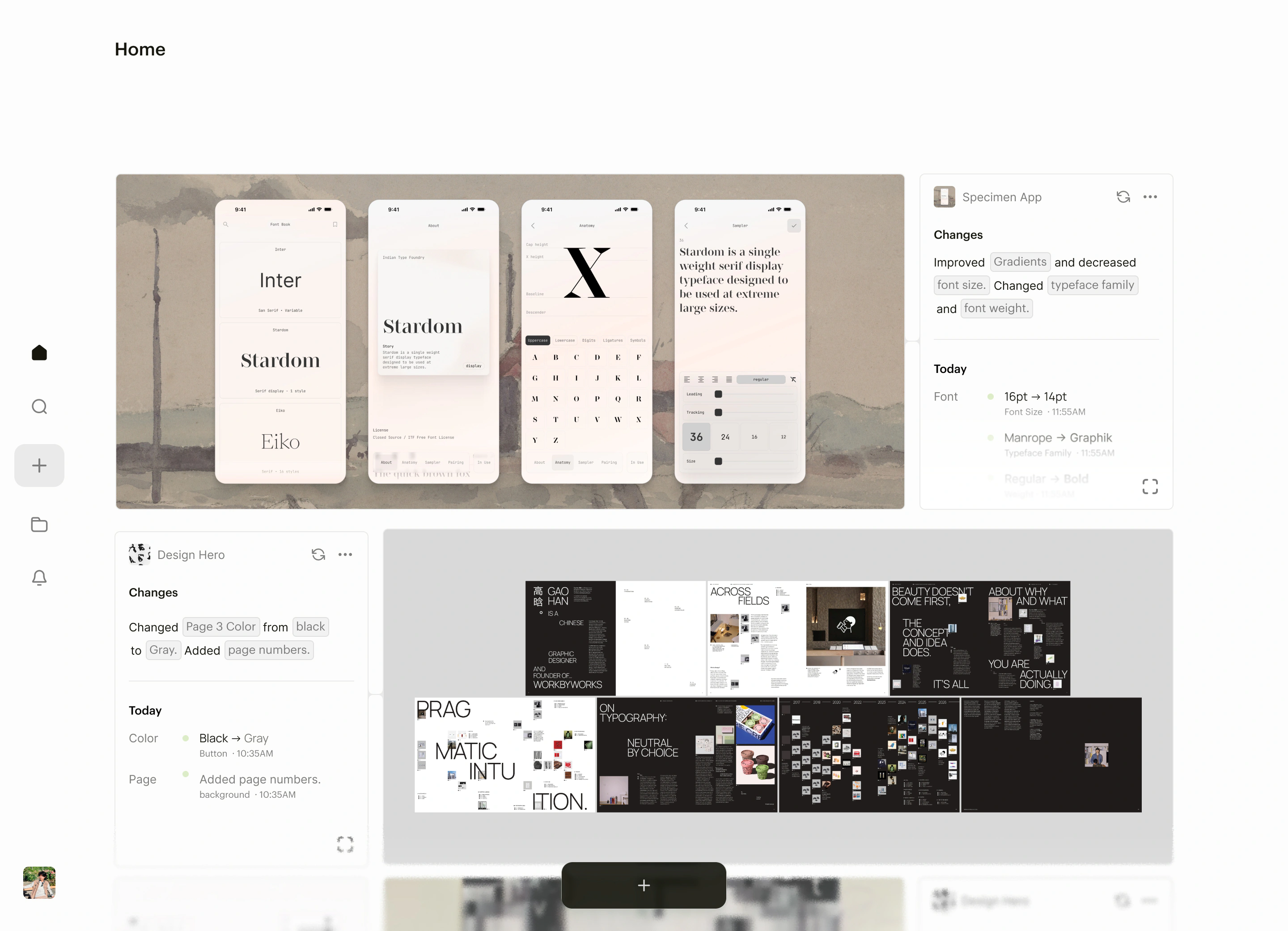
AI sorting to reduce organization tax.
Drop in any file and NCS sorts it into the right project. No tagging, no confirming. If it guesses wrong, you undo.
Changelog
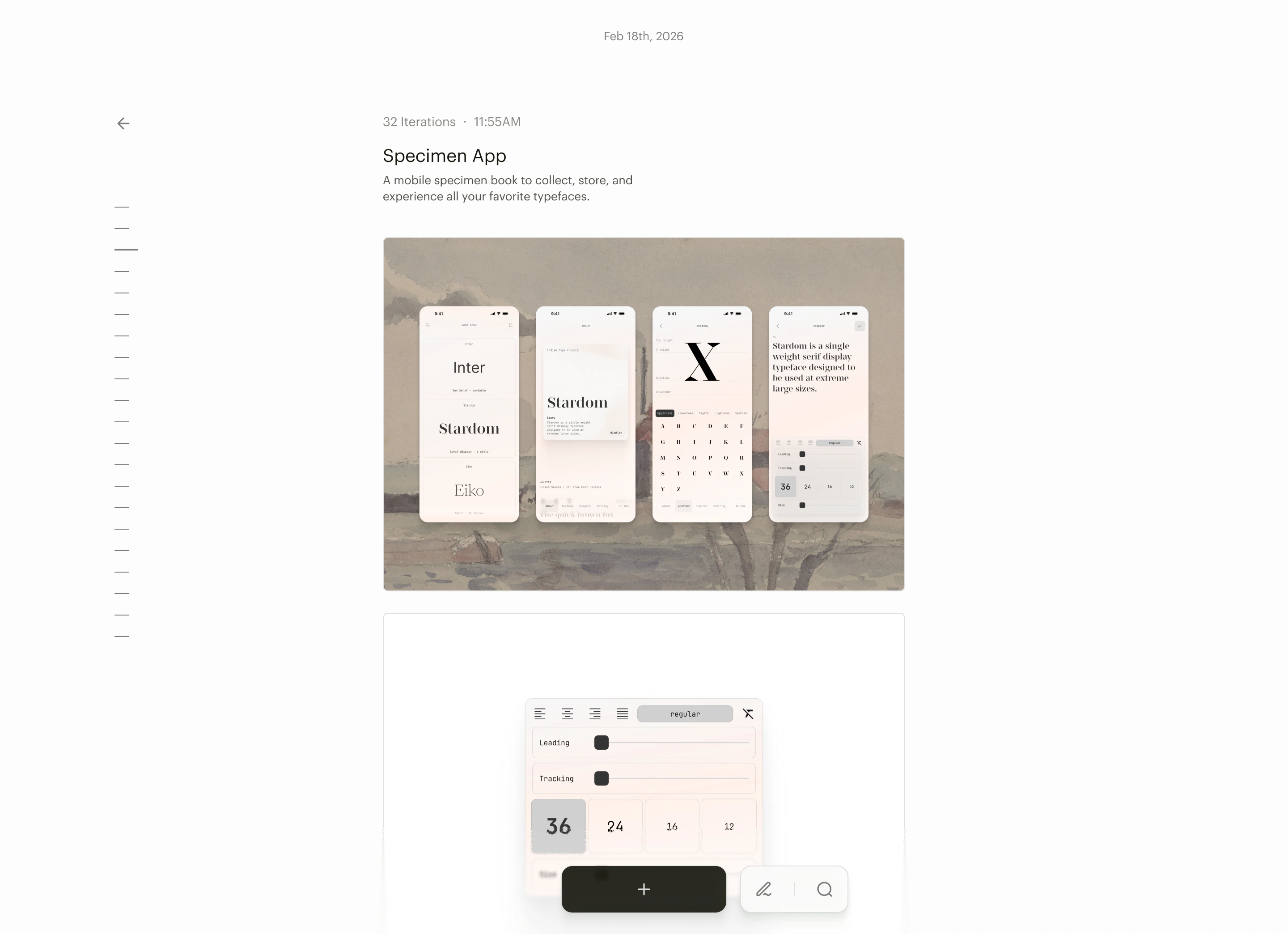
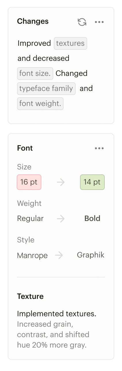
A diary to keep track of forgettable decisions.
After each upload, AI notes what changed. Across iterations, it is easier to remember the decisions made in the past.
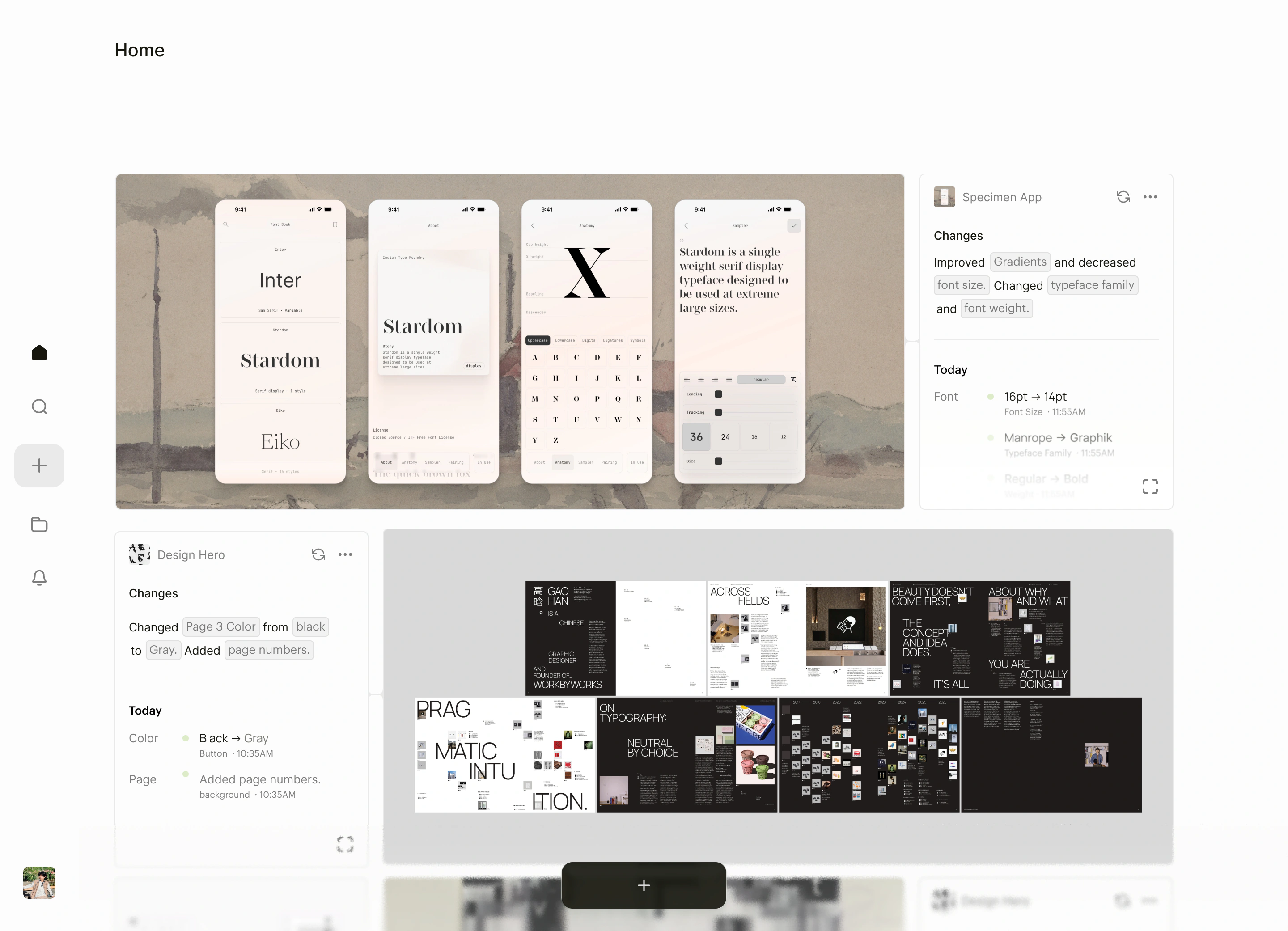
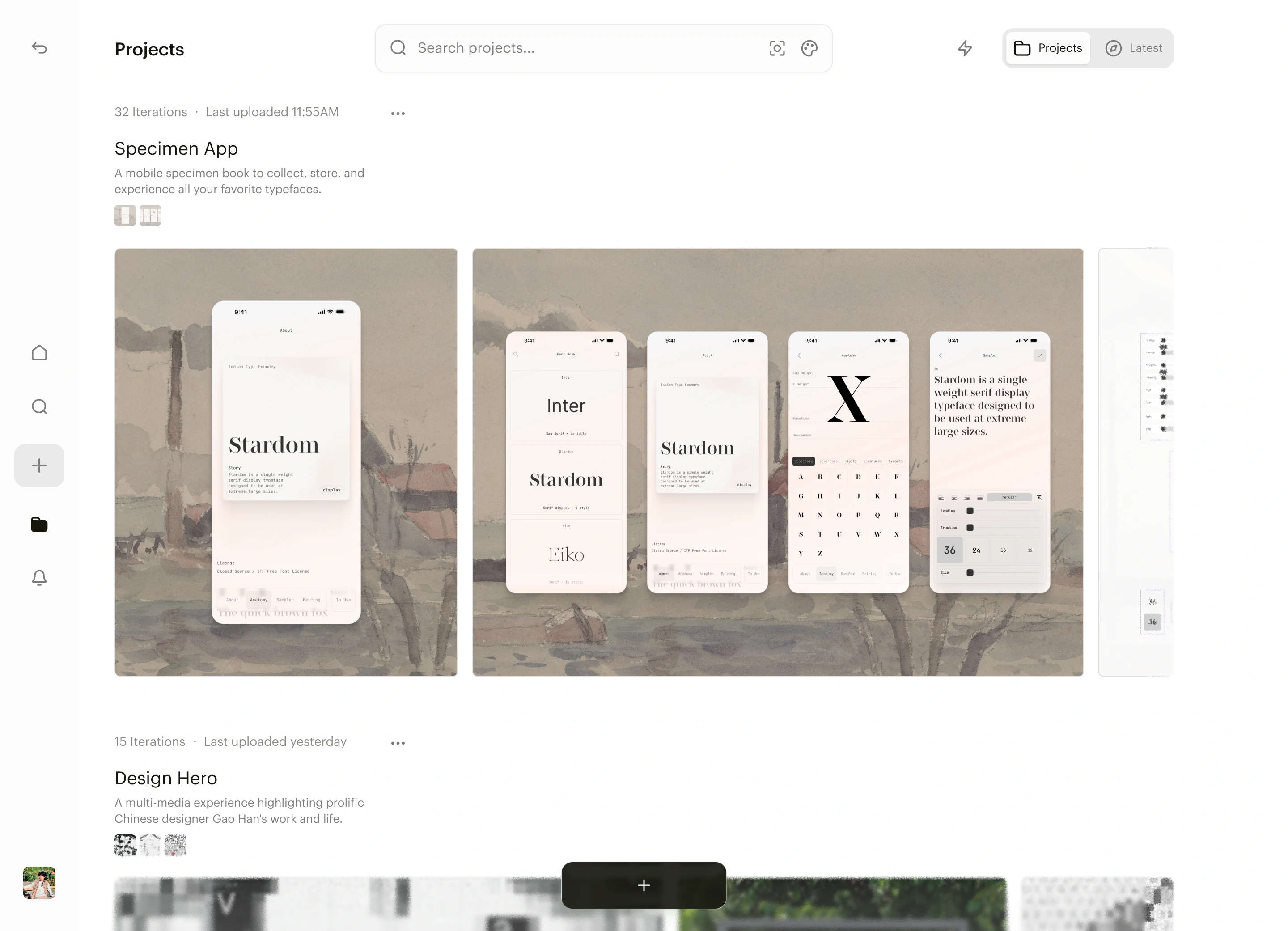
Project view
A central overview for all your projects.
Every project lives on one page, so you can see where all your work stands at a glance.
Research
Have you ever felt like documenting your work takes just as long as designing itself?

Research
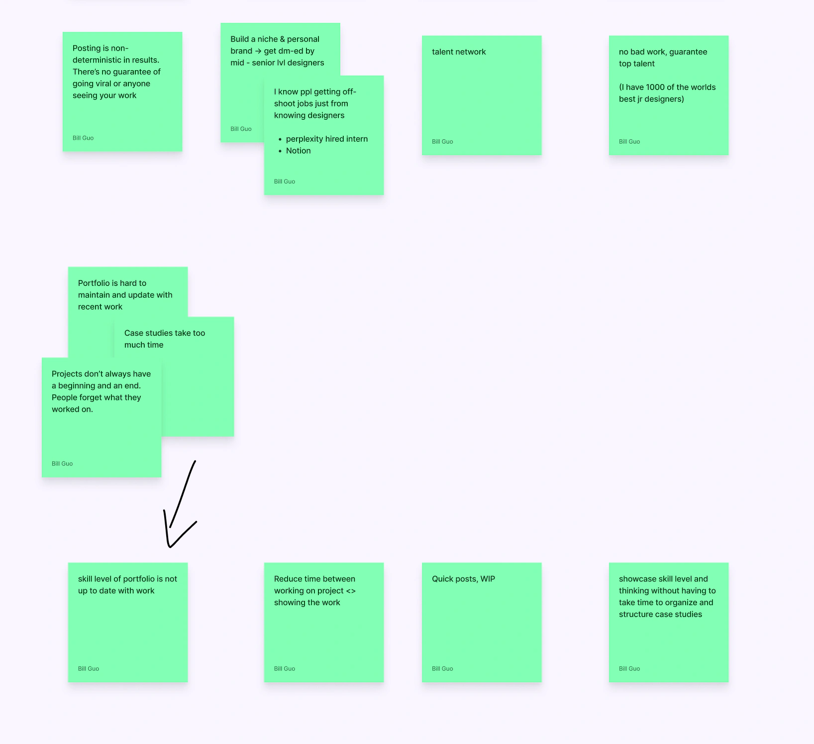
Designers are using tools not made for them to fill in the gaps.
I talked to 30+ designers and ran 10 deep interviews across career stages. In one, I asked Hana, an interaction design student applying to product internships, if a tool for documenting work in progress would help. “I already do that on Medium,” she said. Her portfolio felt too final, so she blogged her process instead.
The insight
They are missing a lightweight WIP layer between raw files and a polished portfolio.
There’s nothing between messy files and a finished case study. Designers need a place for work in progress that’s for themselves.
Process
How can a tool help junior designers land jobs?
Principles
Faster than a doc, visible over time, useful as a tool.
I set three principles before sketching anything. Every direction had to beat writing a doc or blog post, show progress over time, and stay useful even if no one else ever sees it.
Early concepts
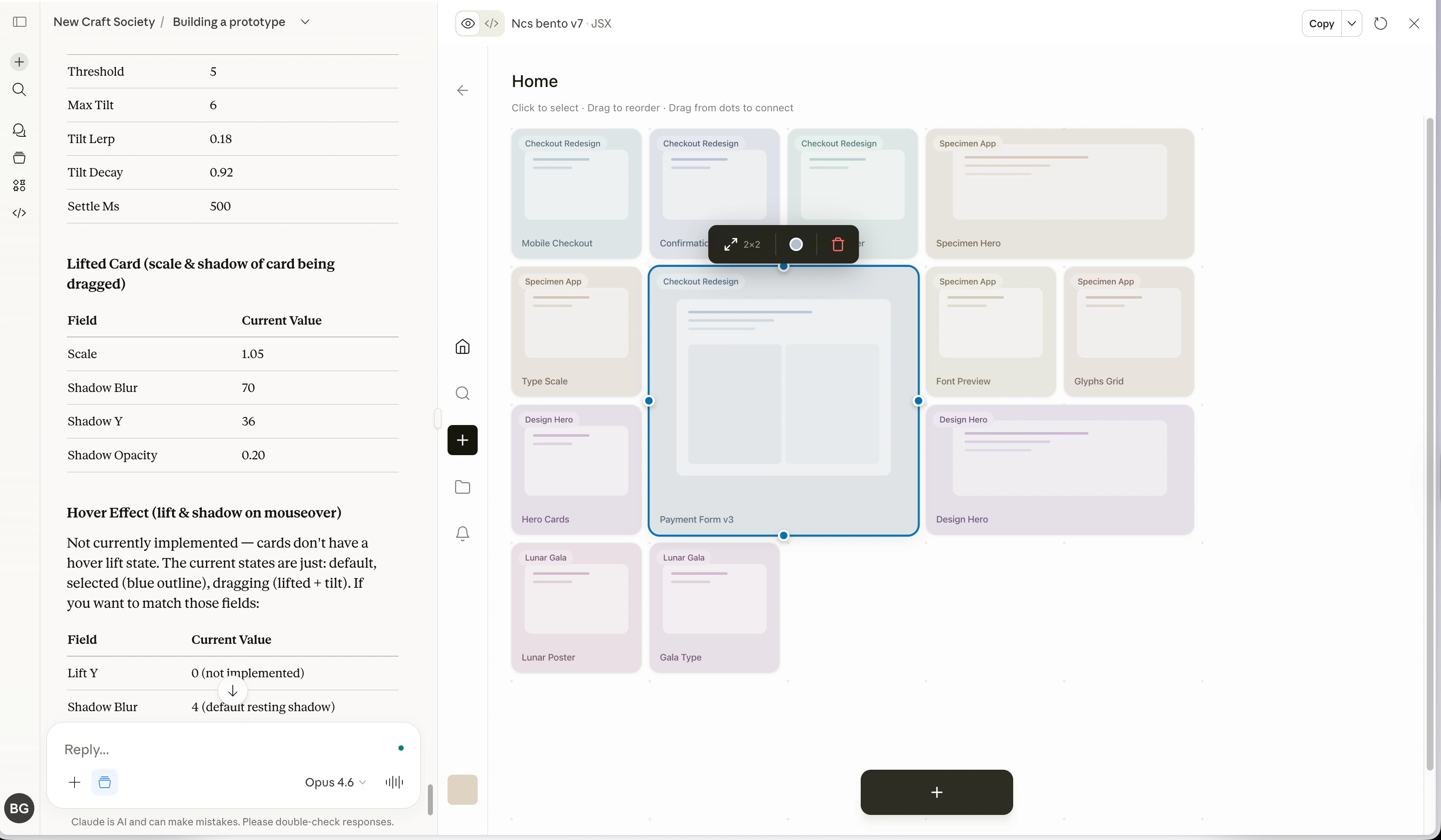
I used Claude Artifacts to quickly mock user flows.
A working prototype of the home grid let me test how uploads land and how people rearrange them.
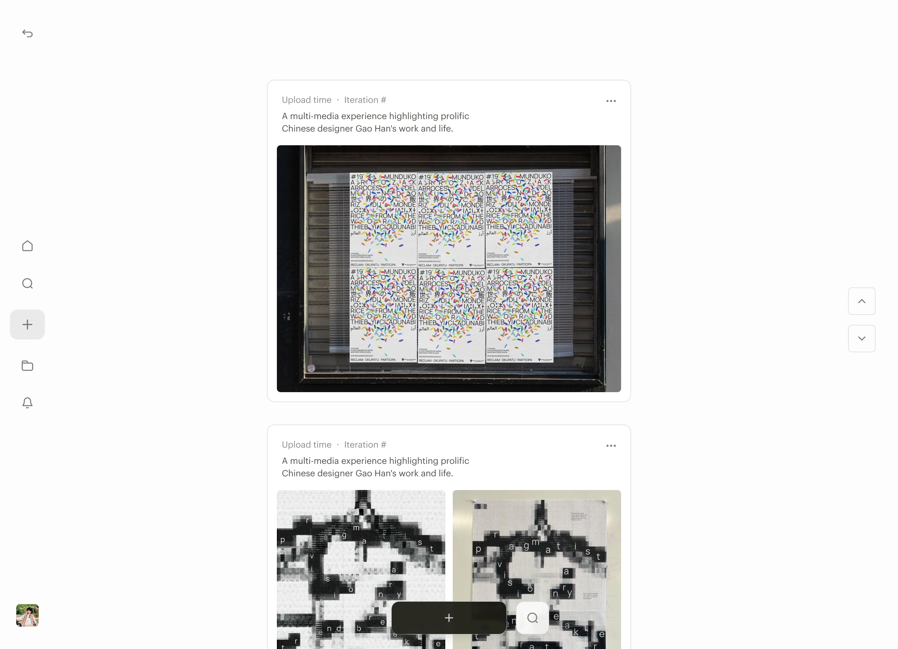
Feed
The first direction was a feed where every upload became a post.
It made every upload feel like publishing, so people held their work back to batch it and write captions first.
Final iteration
A timeline view for continuity.
Every upload joins one continuous stream per project, so you can scroll back through every iteration without deciding which versions are worth keeping.
Engineering
Constraints
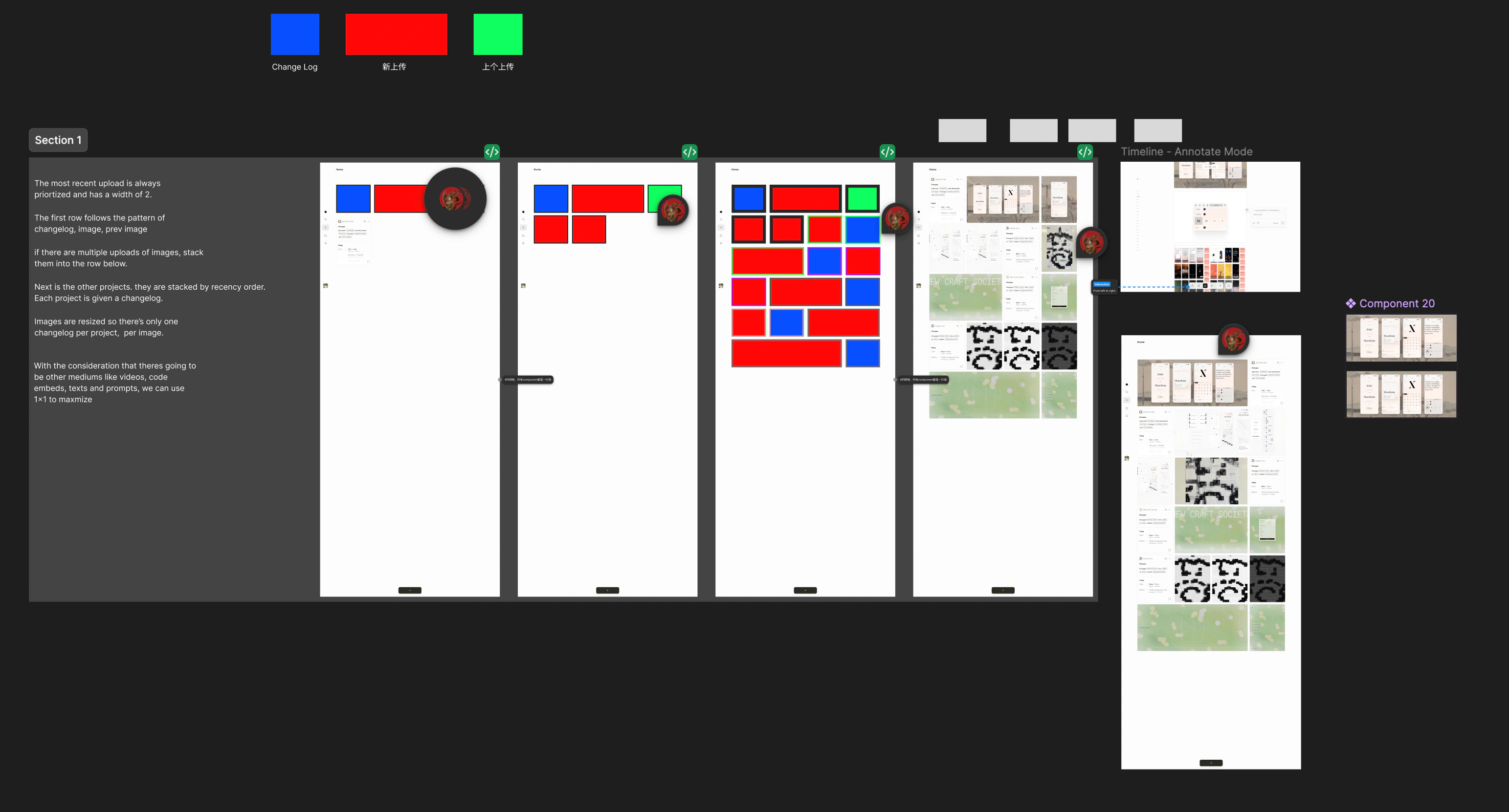
Revamping the image-sorting algorithm for better information hierarchy.
In an engineering standup we hit a wall: the feed had no consistent rule for where new uploads land. I cut features, drag and drop among them, until one rule held. The newest upload leads, at double width, so a project always opens on where it stands now.
Validation
100+ beta signups before launch, after an SF demo and a workshop for 14 designers. Onboarding every user by hand.
Reflection
1.
Talk to designers before you have an answer.
I started with a broad brief and no answer, so I talked to 30+ designers. The value proposition only came into focus after rounds of trial and error.
2.
Set principles early so your future self thanks you.
Scope is the hardest part of any product. With principles set early, every feature had to earn its place, and that saved us a lot of time.
Up next
Case studies
See what else I’ve been working on.
Kensho Technologies 🔒Designed evidence tools for S&P Global analysts.