WK-3
Design Hero —
Gao Han & typographic efficiency
Celebrating the work and philosophy of the prolific Chinese designer and commercialist.
- Brand Identity
- Motion
- Web
- Editorial Design
- Typography
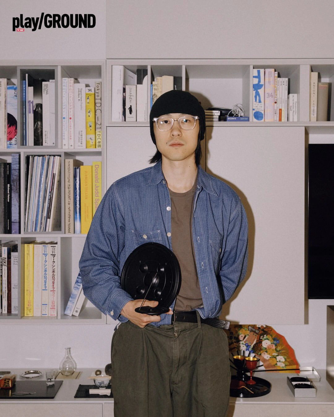
When asked to choose a design hero, someone who inspires me as a designer, my first picks were chosen for their style. Ultimately, I chose Gao Han for his thinking.
He is a pragmatist at heart, a visionary who holds his personal voice and his commercial work in careful balance without letting either one dilute the other. Through studying his works, I developed a balance between my aesthetically driven tendencies and his logical approach.
Animation
Visualizing Gao Han’s obsession through motion.
The animation is an opportunity to dive deep into Gao Han’s life, work, philosophy, and legacy.
At his core, Gao Han is a commercialist with a long list of clients. I showcased his enormous body of work through simple sans-serif typefaces, a curated index system, and intricate grid layouts.
Booklet
Constraint as an anchor to creativity.
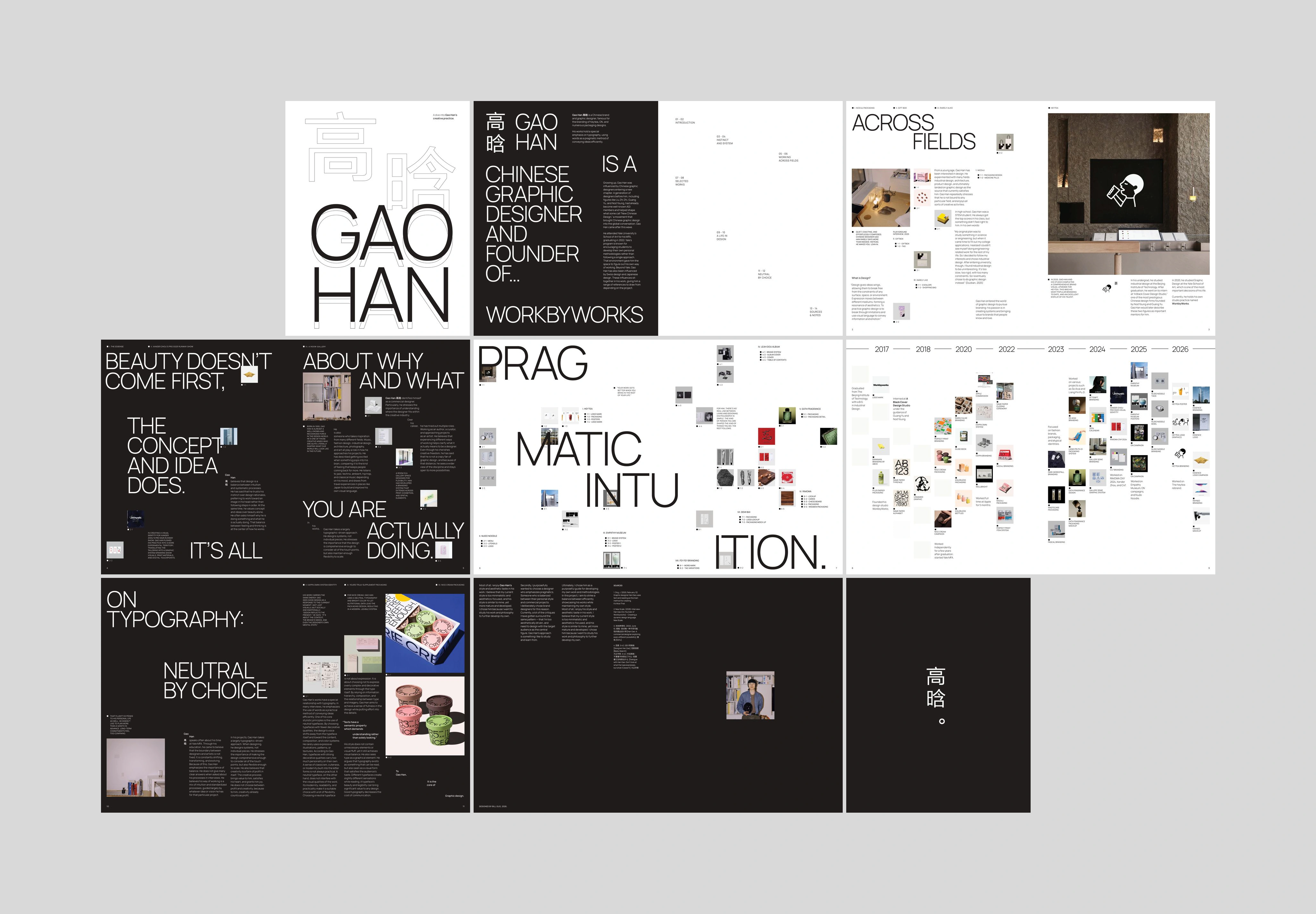
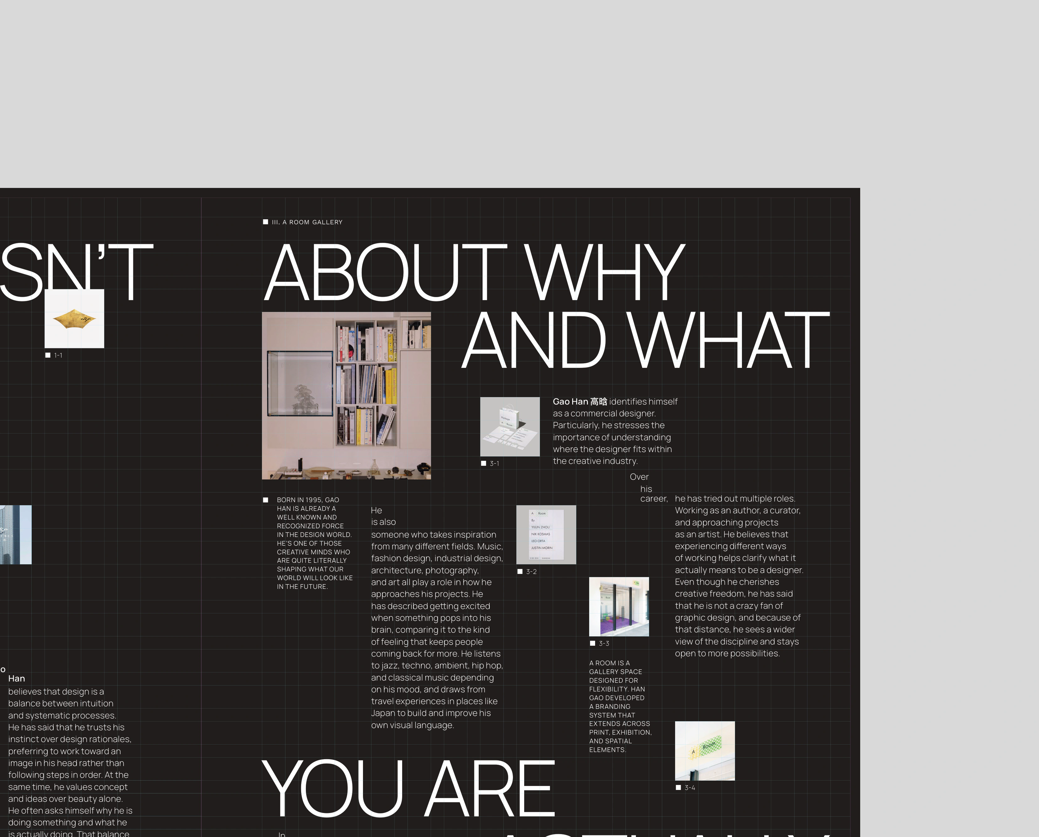
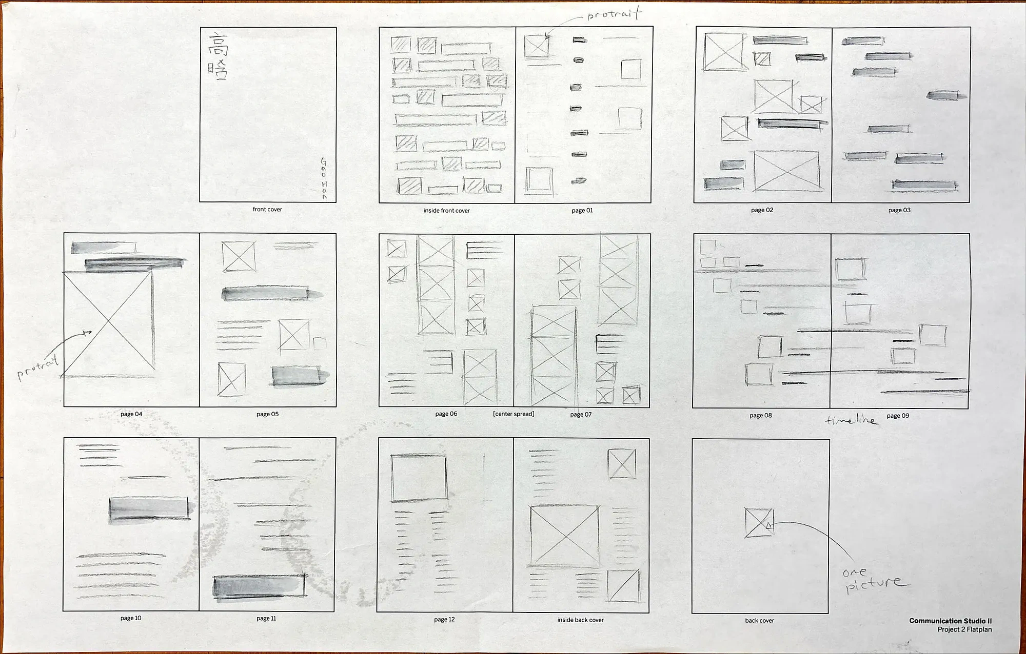
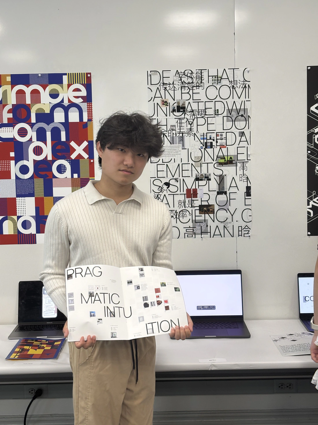
Through 16 pages, this booklet chronicles Gao Han’s life story and multifaceted practice. I established a firm design system through these three elements:
- Minimalistic sans serif typeface (Manrope)
- Golden ratio font-scales
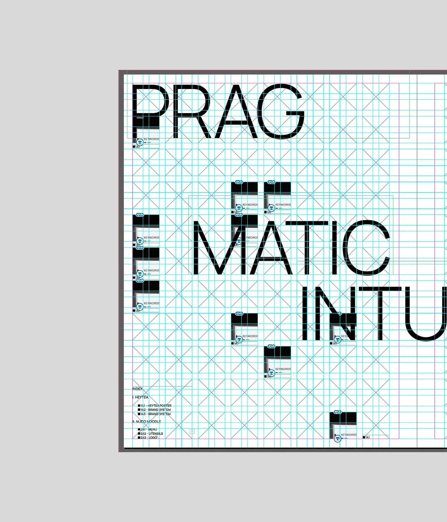
- Square-based grid
Each page highlights a different aspect of Gao Han’s life and his philosophy, from his childhood growing up as a STEM student, to his unique, logical approach to design, to his large body of work.
“The things that can be communicated clearly with words don’t need any additional elements. It’s an efficient method. My approach to typography comes from my way of thinking, which is very ‘non-visual’. When I think of a problem, I don’t think if it’s going to look pretty, but rather if it makes sense.”
interview (translated)
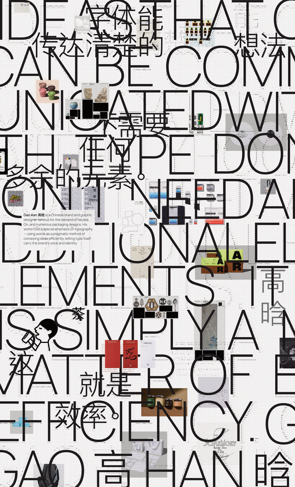
Poster
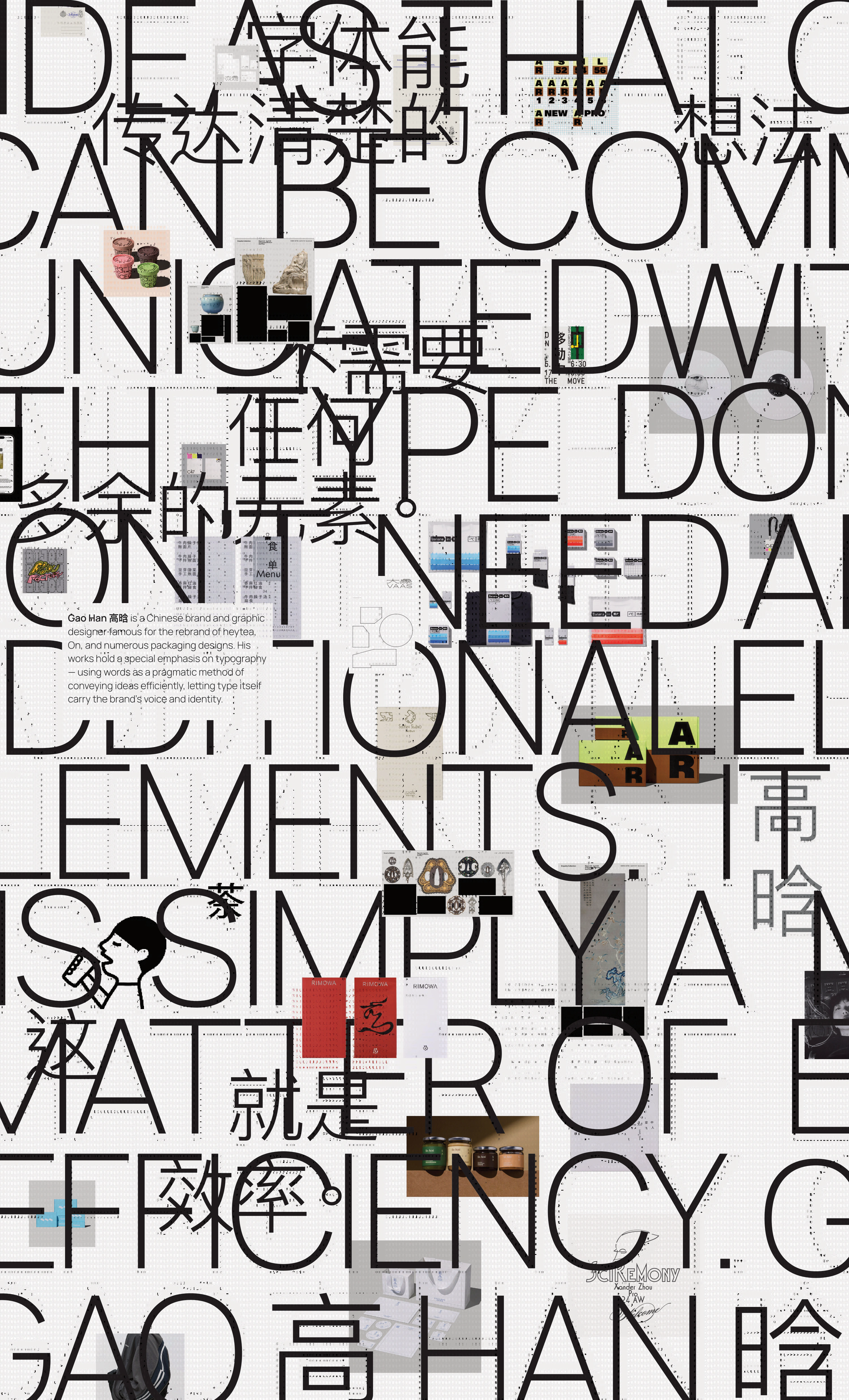
Typography as a visual element.
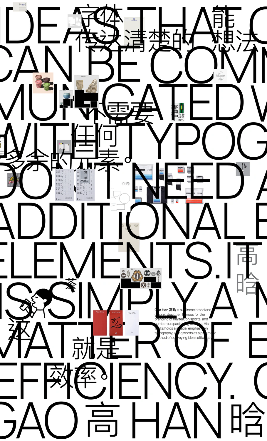
This poster explores Gao Han’s experimental tendencies with rule-breaking grid systems.
I designed a deliberate lack of hierarchy to evoke confusion in the reader, forcing them to dive deeper and pay attention.
Web and app
Taking the system to screens.
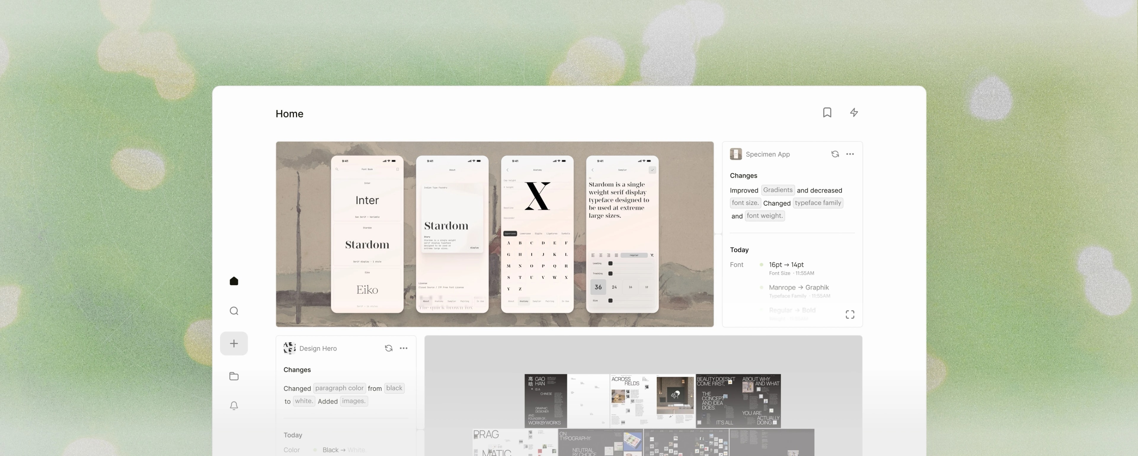
I designed a website and application focusing on Gao Han’s identity. Since he already has a website under his studio name, Workbyworks, I deliberately broke from its composition. Instead, I followed my current design system and focused on square grids and smaller monospace typefaces. Both serve as high-fidelity interactive experiences of his works. Website hand-coded in HTML, CSS & JS. App designed in Figma.
Process
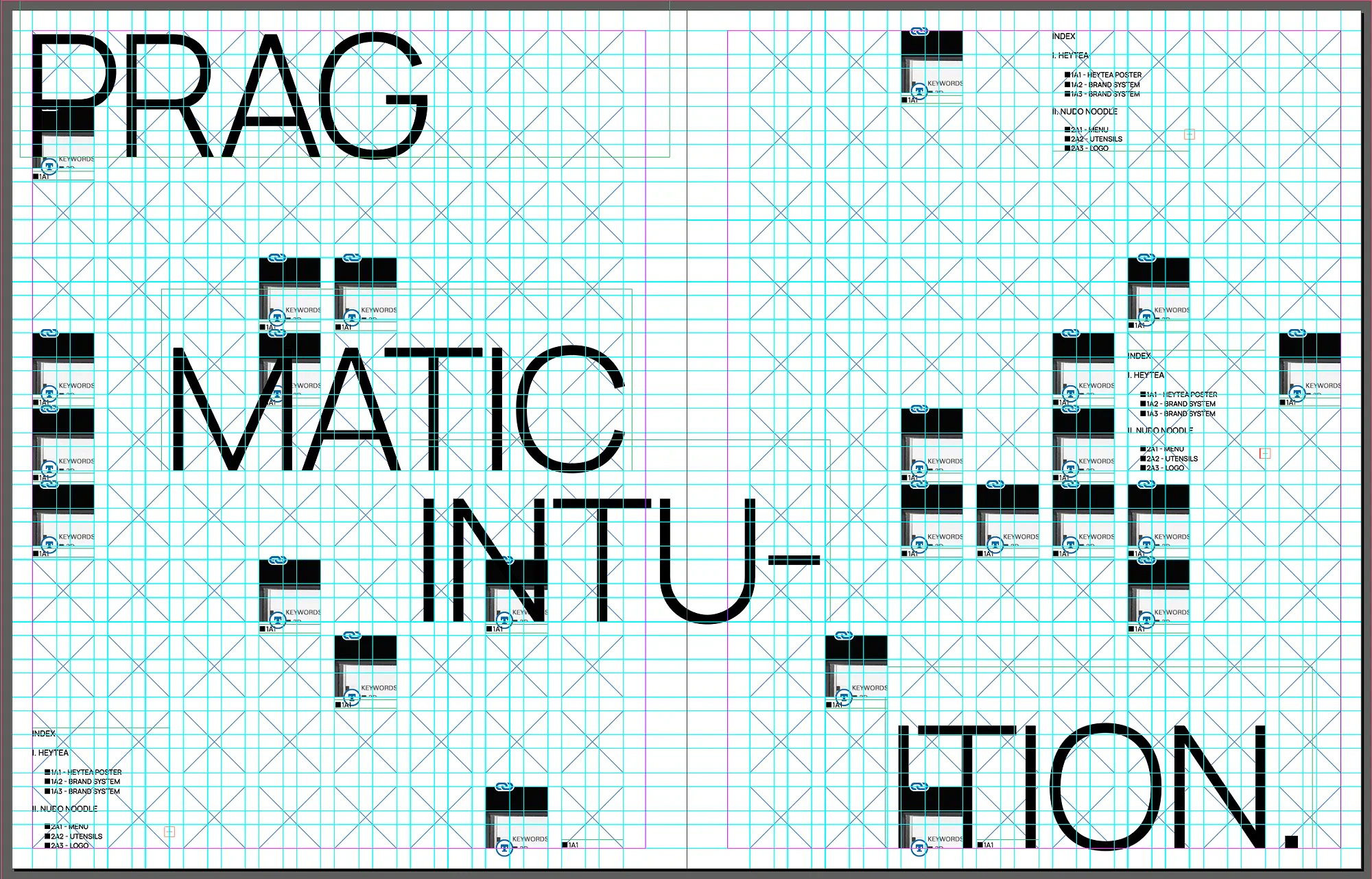
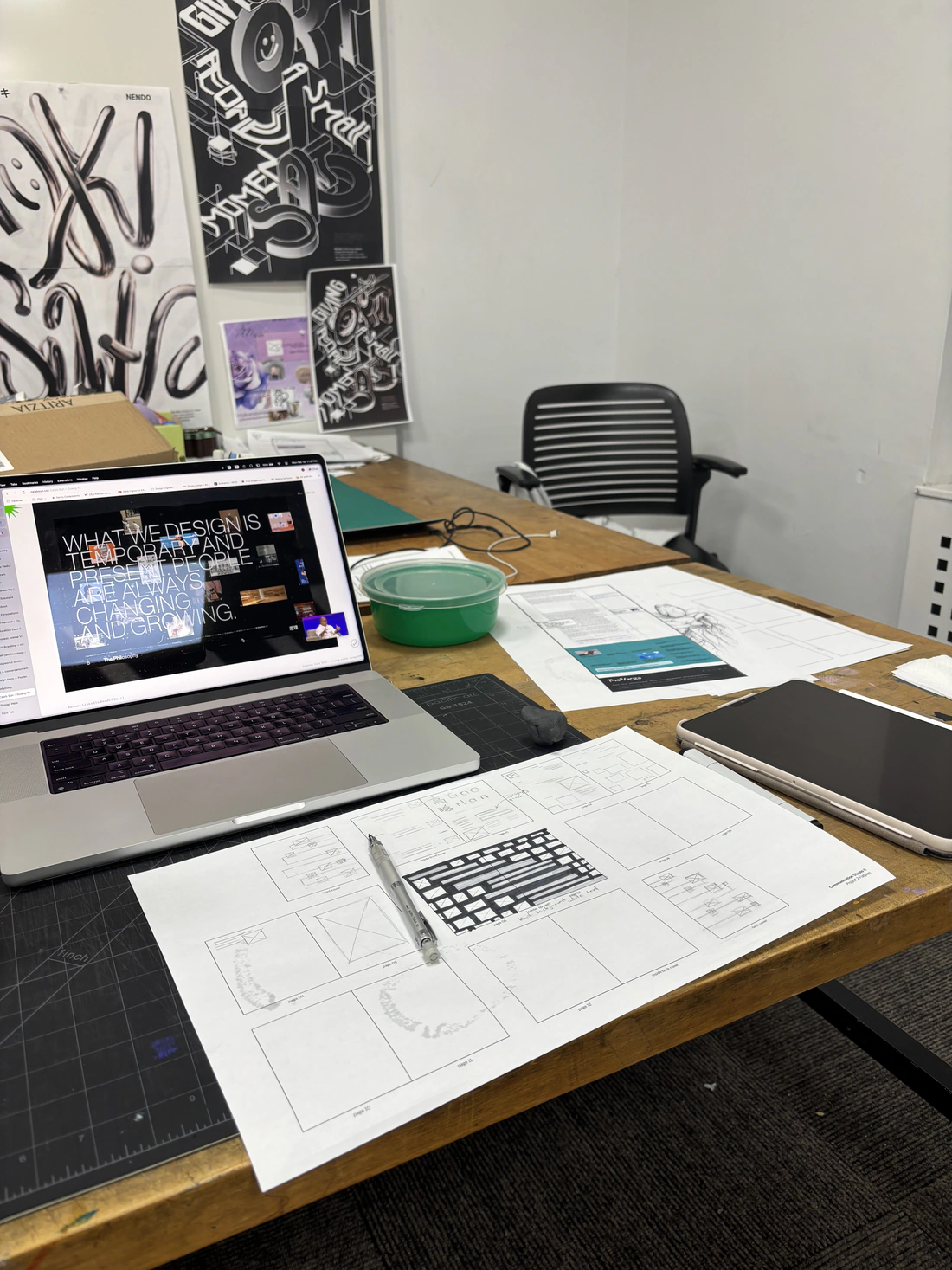
Explorations
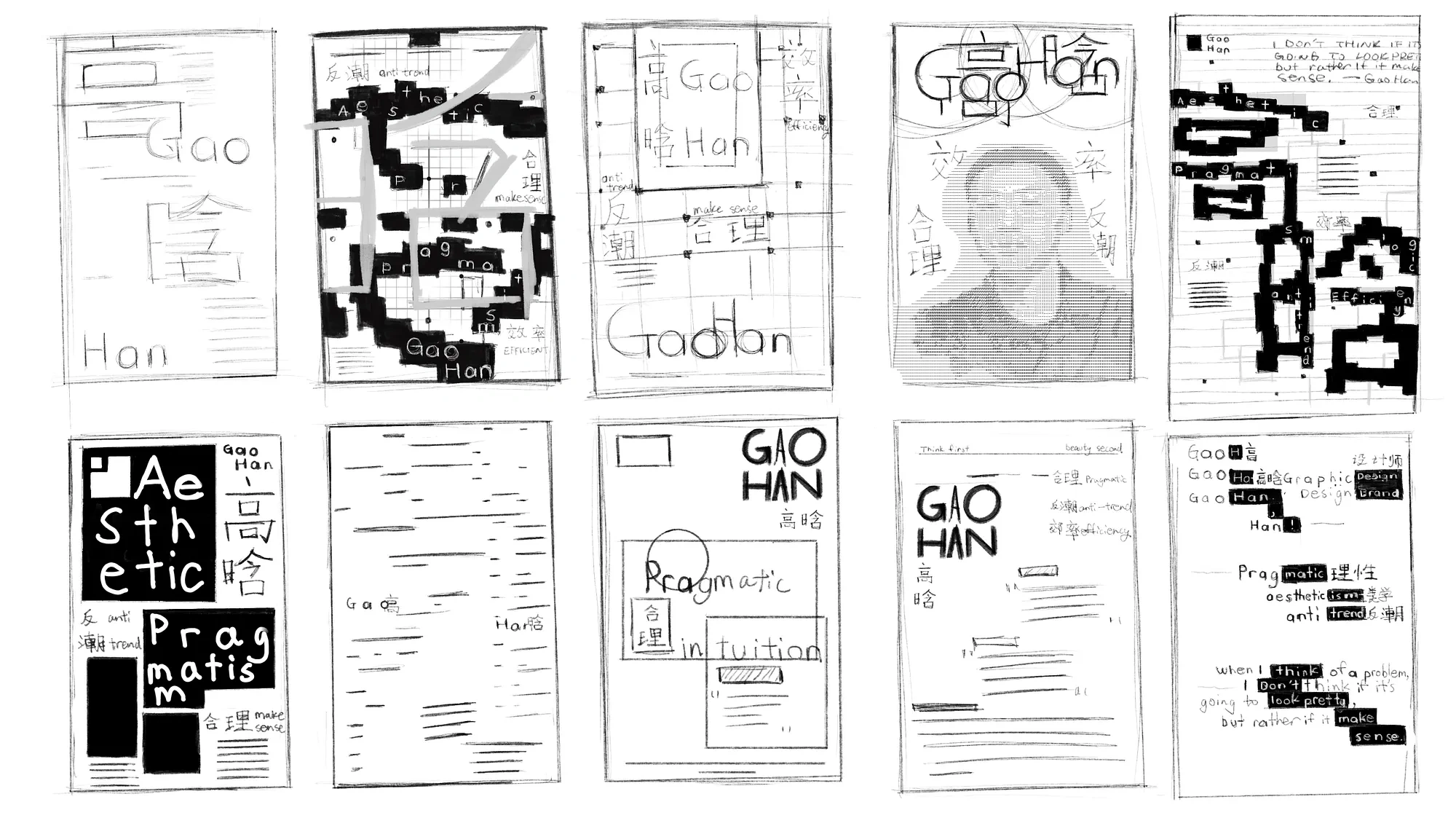
Many iterations, one system.
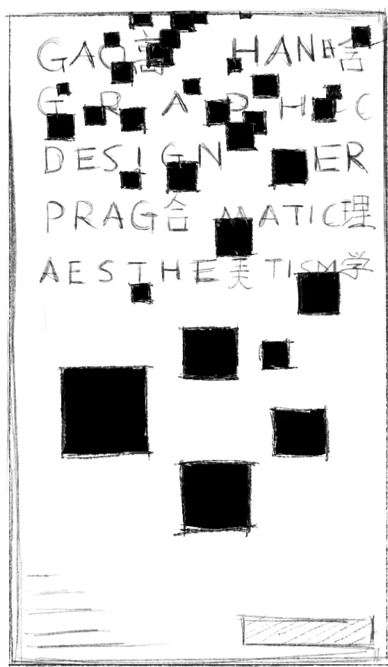
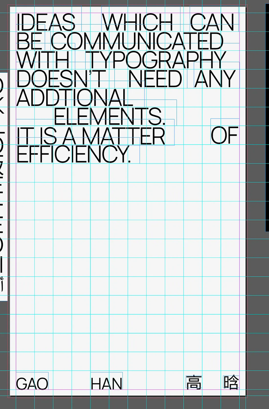
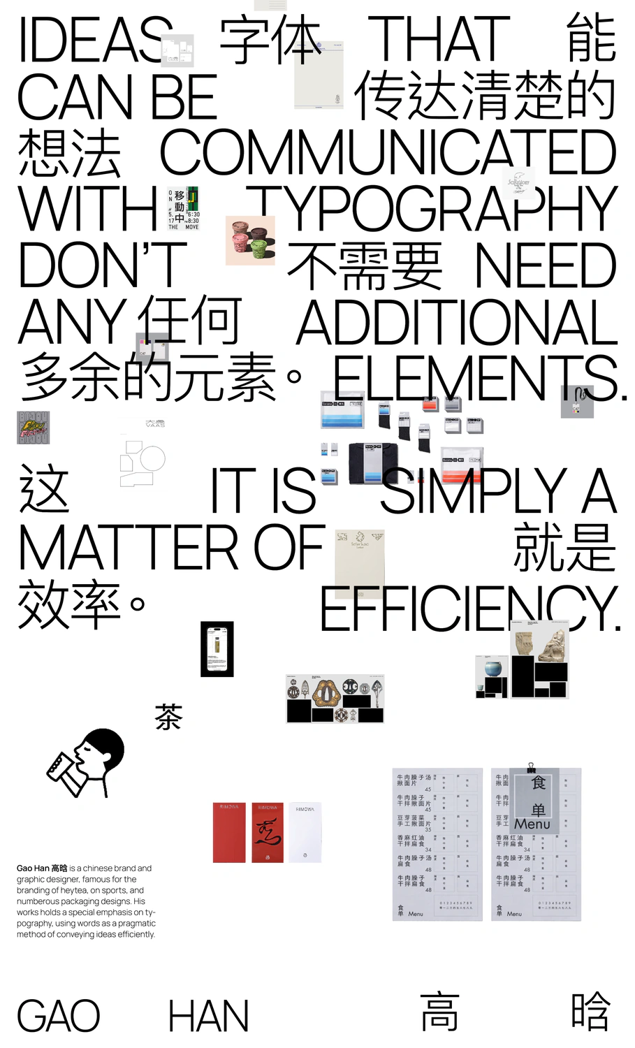
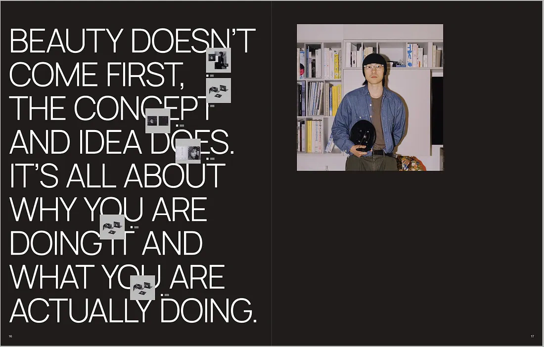
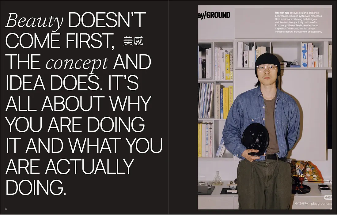
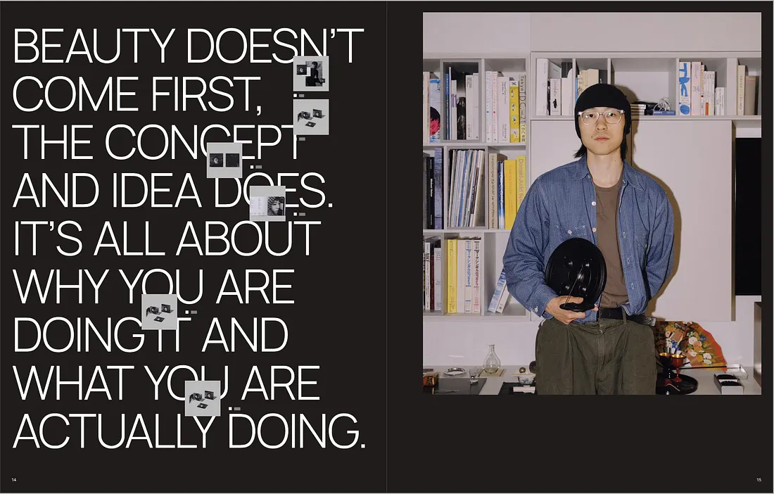
In the beginning, I attempted multiple different iterations of the poster and booklets before establishing a solid system. Most of them focused heavily on communicating Gao Han’s stylistic choices, instead of understanding his philosophy.
In the end, this semester-long project taught me how to plan ahead and design malleable systems. Not only did I design for the medium before me, but I also thought about how it would scale across print, web, motion, and applications. Through studying Gao Han, I now have a new sense of appreciation for pragmatic designers and their way of working.
Reflection
1.
Study a master for how they think.
It’s easy to replicate someone’s aesthetic choices. But the most important lessons come from how they think.
2.
Design for the last medium on day one.
Building a system requires me to have an understanding of every medium on day one. Oftentimes, the best approach is not the most beautiful one, but the most scalable.
I give my endless gratitude to my classmates for the countless late nights, Brett Yasko for advising this project, and Joanna Ni for her guidance.
Up next
Case studies
See what else I’ve been working on.
New Craft SocietyDesigned a tool that makes design process visible. 100+ beta signups.